Typography.com
Redesigned, responsive, and completely remastered.
Homepage
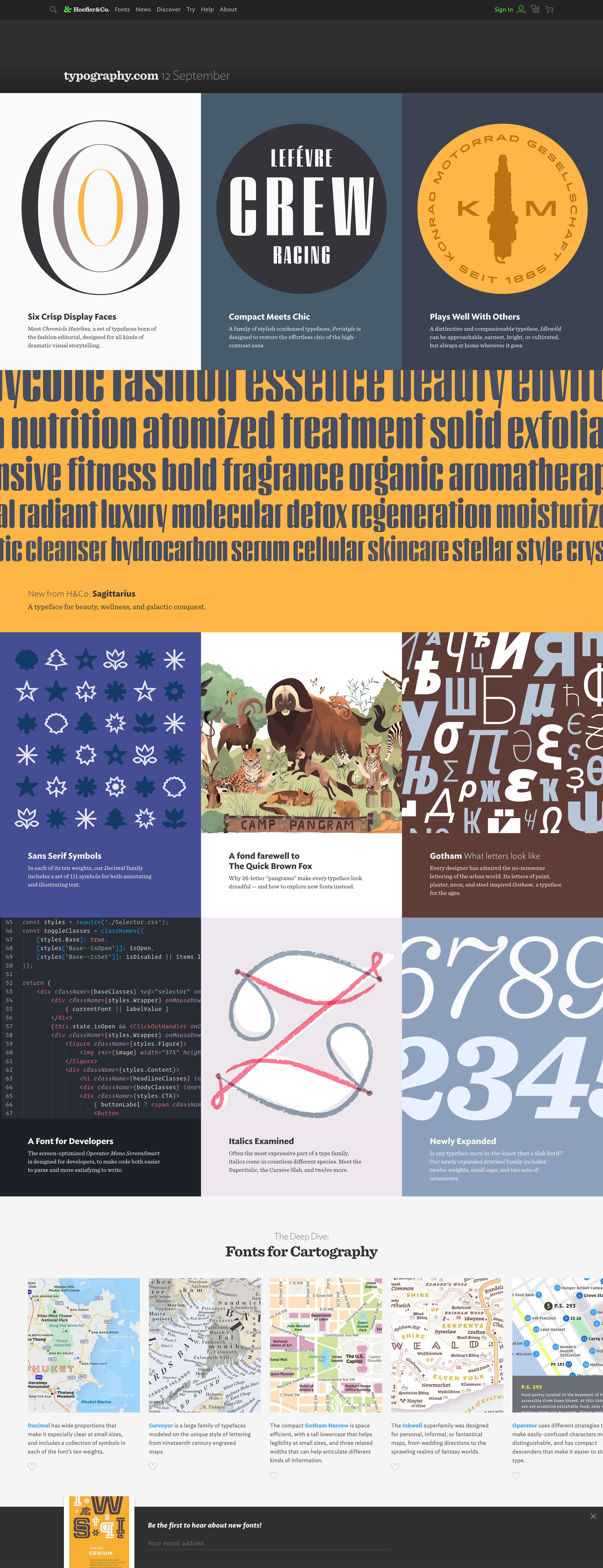
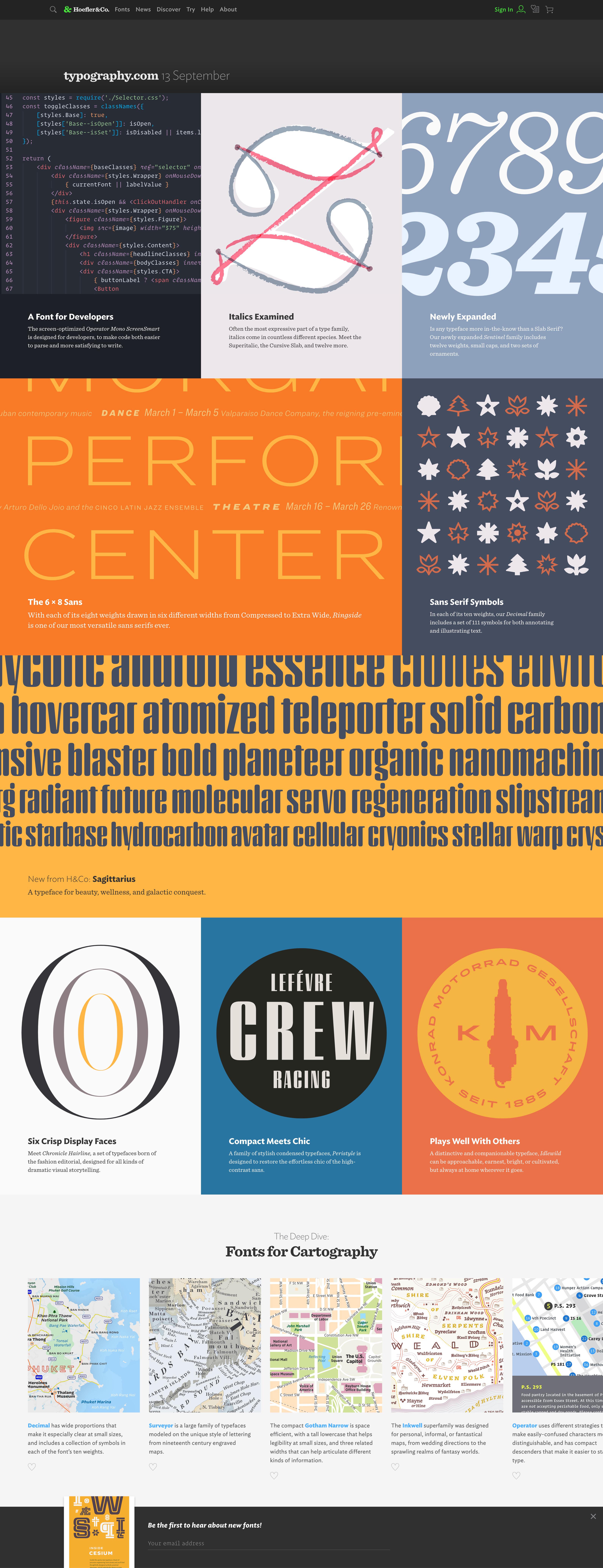
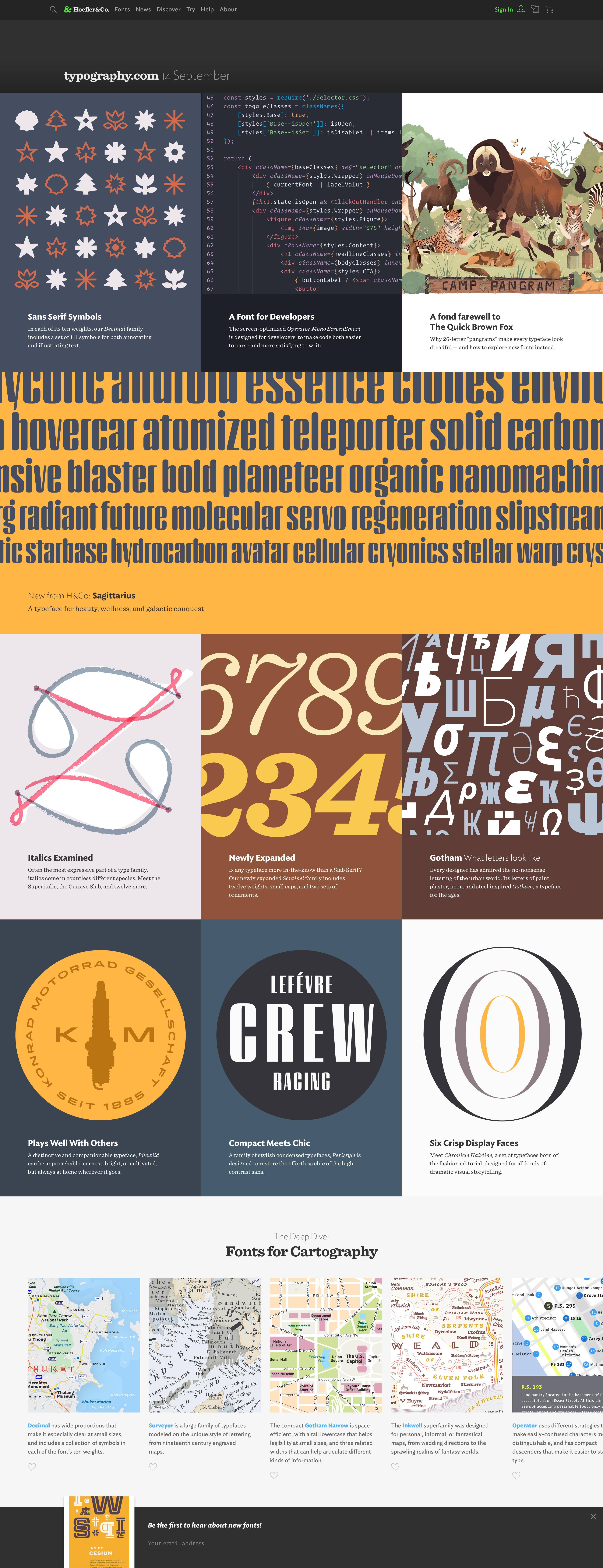
This is typography.com, the home of fonts by Hoefler&Co. Designers come here for typographic inspiration, education, or in search of something new. To keep the site feeling fresh — especially for repeat visitors — I led the design of a modular homepage built on reconfigurable and re-colorable blocks that could be mixed and matched into unlimited combinations of evergreen content. Every day a unique homepage is displayed, its design pulled from a curated set of artfully arranged and colorized modules. A wide-ranging variety of content from new releases, featured fonts, highlighted collections, and interesting blog articles are arranged into a patchwork that keeps visitors informed and inspired. My goal for the homepage was to create and maintain the feeling that there’s always something new to discover inside.


Font Overviews
The landing page for every font family is a beautifully typeset, interactive specimen that gives viewers a taste of everything the fonts can do. For example, display fonts are set at large sizes to highlight the letterforms and unique personality of the typeface, while fully-loaded text fonts show their complete range of weights, postures, small caps, swashes, ligatures, and more. This helps demonstrate the typographic color, legibility, expressiveness, and wide range of voices that can be achieved with a single family. As with everything on the new website, custom specimens were designed, written, and built for desktop and mobile environments, ensuring the type is presented at an appropriate size, perfectly scaled for every visitor’s screen, in every browser, on all devices.
See more interactive specimens.


How To Use
Unlike anything on the previous website — or any website! — the How to Use section provides official documentation and expert recommendations from H&Co’s own type and graphic designers on using every style and feature for every font family across the entire library. Designed to be useful and self-explanatory — even without interaction — our UI encourages visitors to turn features on and off, switch between recommended text settings, and explore examples showing how some of the deepest characters in the fonts can be utilized in real-life use cases.


Packages
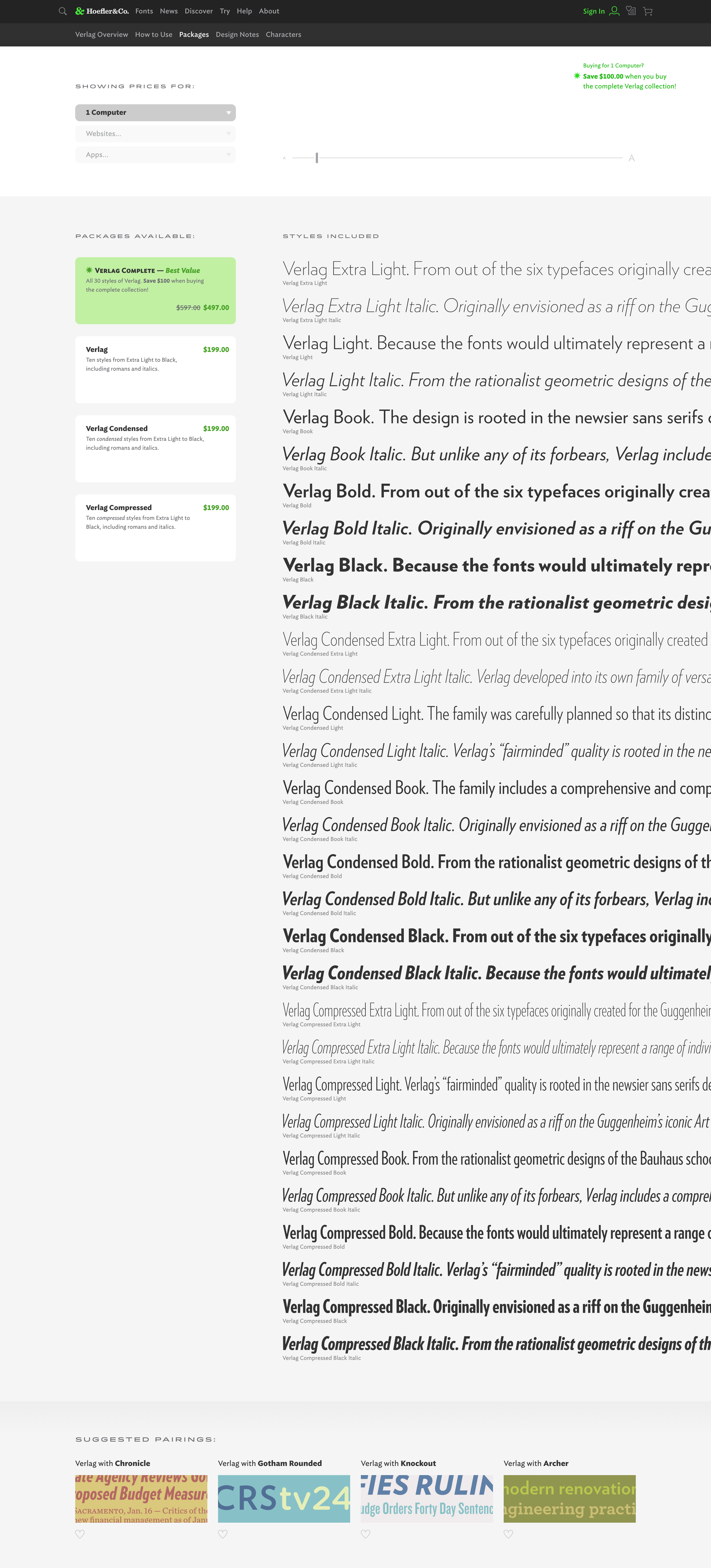
This was the very first page we started for the typography.com redesign, and one of the most challenging. As the main e-commerce page on the site, this is where customers make essential decisions, such as what kind of licenses to purchase, what usage coverage they need, and which font family package includes the styles and features they’re looking for. To help make this process easier, my main objective was to create a crystal-clear presentation of what customers are buying, all displayed in a simple, attractive, user-friendly design. Showing the style specimens at an appropriate size for each family was paramount, as was the ability to resize the type. Visitors can enlarge specimens bananas huge in order to look at every fonts’ finest details before they buy.


Design Notes
This is where the story of every H&Co font lives. It’s where content about the history, inspiration, development, credits, and acknowledgments are found. It’s also the home for all the inspirational artwork created for each typeface. After years of creating the ubiquitous, and endlessly mimicked, H&Co slideshows, I helped design this page with a blank canvas for all new and remastered artwork. Following the fully-responsive approach of the new website, the Design Notes carousel imagery scales up and down with browser size, allowing for much larger, more detailed artwork than ever before, as well as desktop and mobile versions. The result gives everyone the most immersive presentation possible, regardless of their device.


Latest Releases
For customers who simply want to see the most recent work, these are thoughtfully written and designed specimens for every new release, presented chronologically, that capture the breadth and depth of each family in a single, concise piece of art. Like the Design Notes carousels, these specimens also scale up and down with browser size, displaying desktop and mobile versions, creating a fully immersive presentation on any device.


Collections
As on the new Packages page, my goal was to present the style specimens at an appropriate size for each collection. I also wanted to give visitors the ability to resize the type, in order to look at every fonts’ finest details. We also made room for an optional introduction, the ability to include a description, links, Favoriting for highlighted fonts, and example imagery, creating another space on the site where inspirational artwork could be beautifully presented to visitors.


Favorites
Following the Packages and Collections page designs — and once more ensuring the style specimens were presented at an appropriate size for each family — this is a straight-forward list of fonts that visitors have marked as favorites from various places around the site (or from Discover.typography). The Favorites page shows the complete list of styles included in every package on a visitor’s list, as well as the font license and usage previously selected (or a link to go make that choice, if they haven’t), the price to purchase this exact configuration, and prominent “add to cart” CTAs, all arranged in a clean and simple UI. My primary objective here was to guide customers to their shopping carts, full of all the fonts they love, through a seamless process that feels easy and uncomplicated.


