ProFarm & AgNetworks
Branding fifty years of building connections.
Family-owned and operated for over half a century, ProFarm provides farm machinery and services across the southeastern United States. Operating continuously but under different names, the business lacked any official branding, most commonly known as “Professional Farm Service” or “the Hammond family business.” AgNetworks, a new venture from the same owners, connects farmers, technology leaders, and policy makers to shape the future of modern agriculture.
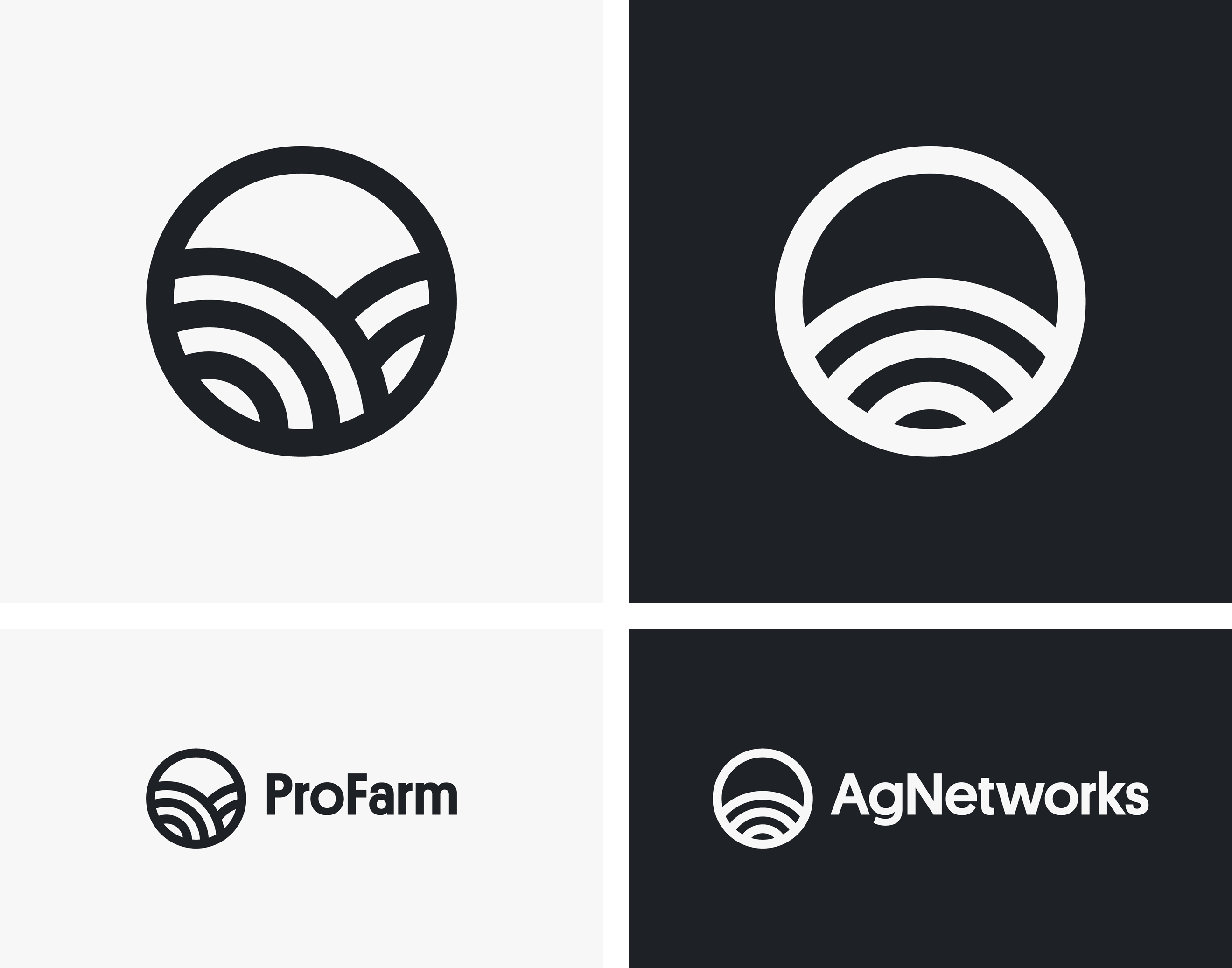
Part of a branding exercise for both businesses, the Handbook team reached out to me to develop two logos in tandem. While multiple concepts were developed, an irresistible visual connection sealed the deal on the final direction. During sketching, I identified a shared graphic symbol between the two brands: crop lines, a visual universally associated with farming landscapes, and signal lines, commonly used to indicate wi-fi, networks, communication, and strength. The resulting marks are clean, graphic represenations of these concepts, as straightforward as it gets. They’re drawn in a monolinear style, with no visible variation in stroke weight, which make them excellent candidates to combine with a geometric sans serif typeface like Platform from Commercial Type. The shapes of the logos naturally reference the wide, circular characters e, g, and o, and are beautifully contrasted by the narrow forms a, r, and s, creating an unexpected, imperfect, organic rhythm. The result: two contemporary brands with honest, approachable personalities that are equally successful individually or as a set.

We created custom ProFarm emblems for the owners to reciprocate appreciation to customers and employees. These emblems, designed for apparel, caps, patches, and more, are a nod to the business’s history and feel at once contemporary and timeless, playing the part of surviving artifacts from past iterations of a brand that never really existed. They vary in feel from utilitarian to stylish, fine to heavy, quiet to energetic, and all burst with ProFarm pride. Across the nine emblems, all are simple treatments that avoid ornamentation and utilize a total of just three font weights. No italics, no small caps, no stylistic alternates, just uppercase and lowercase letters, thoughtfully arranged to create a lot from a little. Getting the most out of your resources… that’s a concept farmers can appreciate.
Credits: Design direction by Robert Jones, Handbook. Fonts: Platform by Commercial Type.